Why I love Bruichladdich Old Skool so much
I’ve done more than a few packaging announcements in my time in whisky. And you don’t need Jane Austen to tell you that it’s a truth universally acknowledged that the “innovative new look and feel that showcases the flavour cues of the range” is actually just a sans serif font and a splash of purple.
Yes, some packaging news is more interesting than others. But generally, it’s a hygiene factor to stop a brand falling behind competitors that have already embraced sans serif (said with tongue firmly in cheek).
That’s the context as to why I love the Bruichladdich Old Skool launch so much.
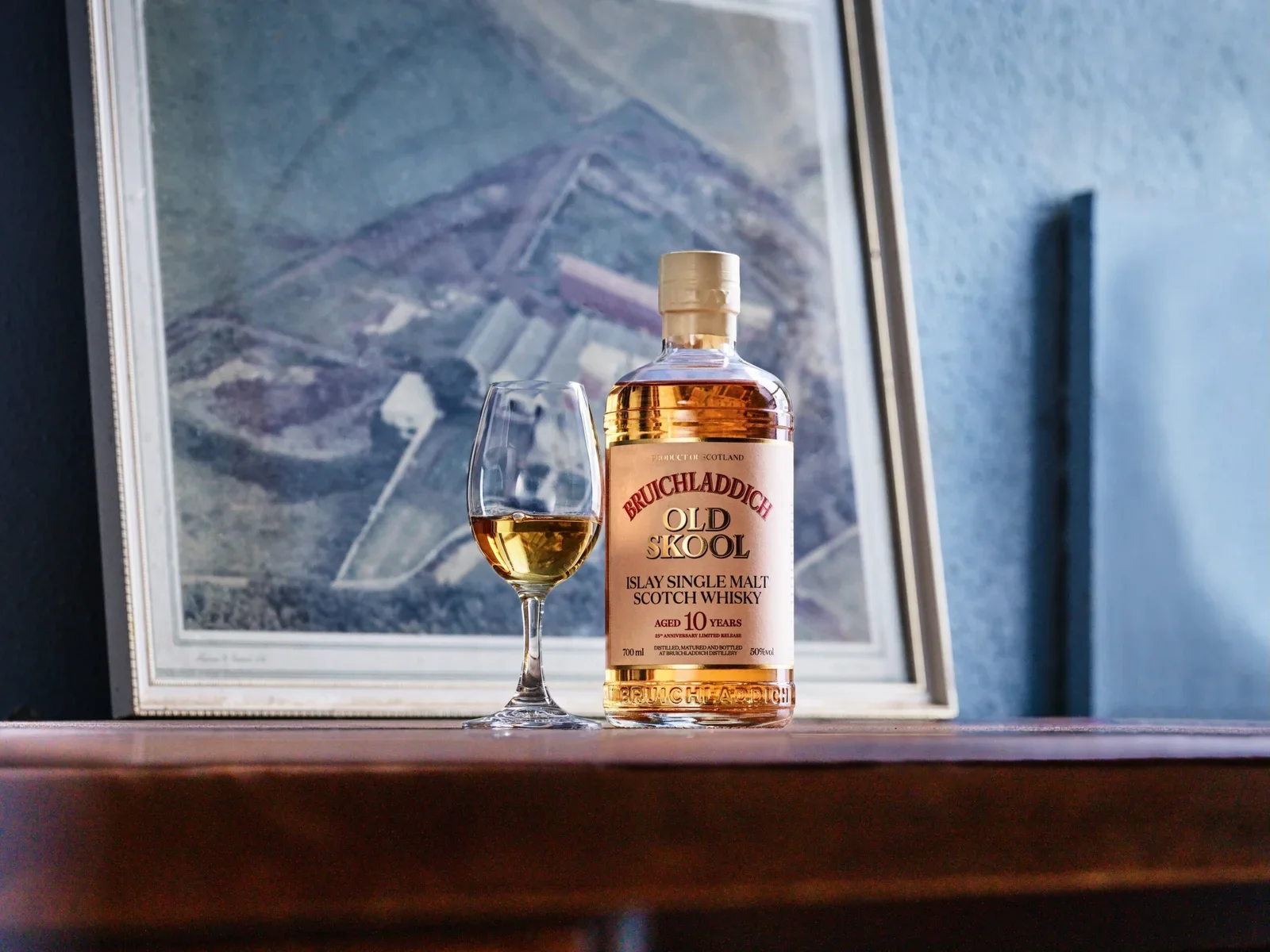
For those who haven’t seen it, Bruichladdich Old Skool celebrates 25 years since the rebirth of the distillery. To mark the milestone, the brand has unveiled a 10yo whisky with a retro label that throws back to the labels of the 80s.
My old boss used to say there are only 15 creative ideas and every story is just a variation on one of them. This is the nostalgia idea: Release something new that looks like something old.
The one crucial thing that’s missing from this is the price. To make this idea best-in-class, they should have sold the expression at 2001 prices. But I assume a mixture of tax and faff got in the way of that.
Nonetheless. It’s a cracking idea. For lots of reasons.
1 - Radical focus
Firstly, the clarity of it. The brief may have said to include sustainability credentials, provenance, history, culture, design, flavour, whisky technicals, etc etc. But the idea manages to focus on a single thing - 25 years of making whisky - with everything else available only to those who keep reading below the headline.
That’s what an idea should be. And this requires trust. Which is the next reason I love it.
2 - Client bravery
Either:
* the brief didn’t insist on cramming every message in, or
* the people involved were good enough to guide it away from that instinct
It would have been very easy to overload this and try to squeeze in every brand pillar or value. Instead, they’ve done the opposite. They’ve landed on an idea that is crystal clear on the surface, and then layered the detail underneath. It takes bravery from a client to sign that sort of idea off (there’s a reason the old adage is to make the logo bigger).
You still get everything important but it’s revealed after you’ve been pulled in and not before.
3 - Liquid integrity
The third reason I love this release: the liquid. It’s 10yo Bruichladdich made with Islay barley. That’s the core! This limited edition to celebrate two and half decades is made from exactly the same stuff that has got them to this milestone in the first place.
They have doubled down on what they’re known for. They’ve resisted the industry standard to release some mad decanter made of spider’s webs and magic. And the result is a liquid that doesn’t just fit the distillery character, it is the definition of the distillery character.
That pulls the liquid story back and lets the label shine.
It’s almost as if this was a marketing/PR idea that made it out of the PowerPoint and into the real world. As opposed to an idea reverse-engineered based on available stocks and bottling-line capacity.
I could go on. The point is, this is such a simple idea that’s been executed with style and substance. And with a clarity that a lot of marketing people would kill for.
Well done, Bruichladdich.
Final nod also to the Game of Thrones style animation on the website. I can almost hear the cellos now…